Introduction:
A pitch deck is a powerful narrative that startups or founders’ piece together to highlight and explain their business idea or concept and impress investors in the hope of raising funds for their company. The design of pitch deck and structure of the presentation shall help investors get an understanding of the company in a crisp yet engaging manner. You need a fine eye to craft the design of the pitch deck to communicate your idea as an elevator pitch. The pitch deck design sets up the expectations of investors: polished for success and dull for failure.
Here are our design tips for fund raising pitch deck
1- Simple brand identity: A pitch deck needs to be simple and easy to understand but shall speak volumes about your brand. A right combination of imagery and colours creates an impression about your brand identity. Investors understand your business and put a value through the lens of your brand only. For startups with no brand, use visuals and colour scheme that best represent what your brand promise is. Colours has the potential to influence emotions and moods of your investors, so use it wisely. Your fitment in investor’s portfolio depends upon the fitment of colour and visuals in your pitch deck. Visuals hold more appeal than plain text to evoke curiosity in a brief time span, and make your time counts with investors.
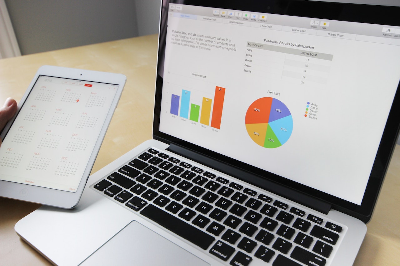
2- Display numbers with interesting charts: Investors are numbers savvy and are experts in creating an imagery of all numbers that matter. Being short on time, Investors would like to grasp crucial numbers of your business in an easy manner rather than scouting for numbers in long sentences or tedious paragraph. Graphs and charts bring life to numbers, showing trends and highlighting critical numbers. It makes easier to comprehend and navigate between budget, staffing, operational statistics and relative ranking of business features. Pie charts are excellent to represent large amount of data, in a visually appealing way. The centre of the pie chart is a strategic position to convey the message impactfully. Critical market parameters or crucial metrics such as market segmentation, % revenue breakup or spending distribution would lose its appeal without Pie chart.
3- Use icons instead of paragraphs: A picture is worth a thousand words and an icon is worth a million. An icon is a symbolic representation of an intuitive solution or multiple ideas or pinpointed information in a single meaningful still image. Use of icons shape and define the character of your pitch deck by communicating more words in less space and break language barriers. Icons help brand recall or pitch deck content by bonding and resonating with investors. Alpha Valley has custom built designs and array of icons to shape your identity and enhance your appeal. With our pitch deck design service, founders get the iconic power to show rather than tell an investor why you deserve a place in their investment portfolio.

4- XY graph for competitive analysis: A sustained business advantage is only possible if you stay ahead of the competition. Researching product, pricing power and customer experience offered by the competitors enable an organization to gain a competitive edge. This allows startups to generate actionable insights, outpace rivals and create value for customers by communicating differences effectively and taking advantage of gaps available in the marketplace.
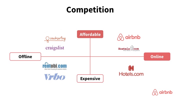
XY graph is an excellent way to depict the value proposition based on a pair of attributes for all the competitors. It beautifully displays your standing vis-à-vis your competitors and a particular attribute. This is an important positioning tool for the startup as the investors are yet to comprehend your business and a novel industry altogether. Your value depends on the conviction of the uniqueness of your offering with respect to competitors.
5- Information in a tiled layout: A winning mind always breaks down a complex or overwhelming problem into smaller problems for focussed attention to solve it. A tiled layout in a presentation helps to present enormous size but still crucial information in a way which investors can relate easily and comprehend better. Use noticeable colours for sections, border design to differentiate and icons for a mindful transfer of information.
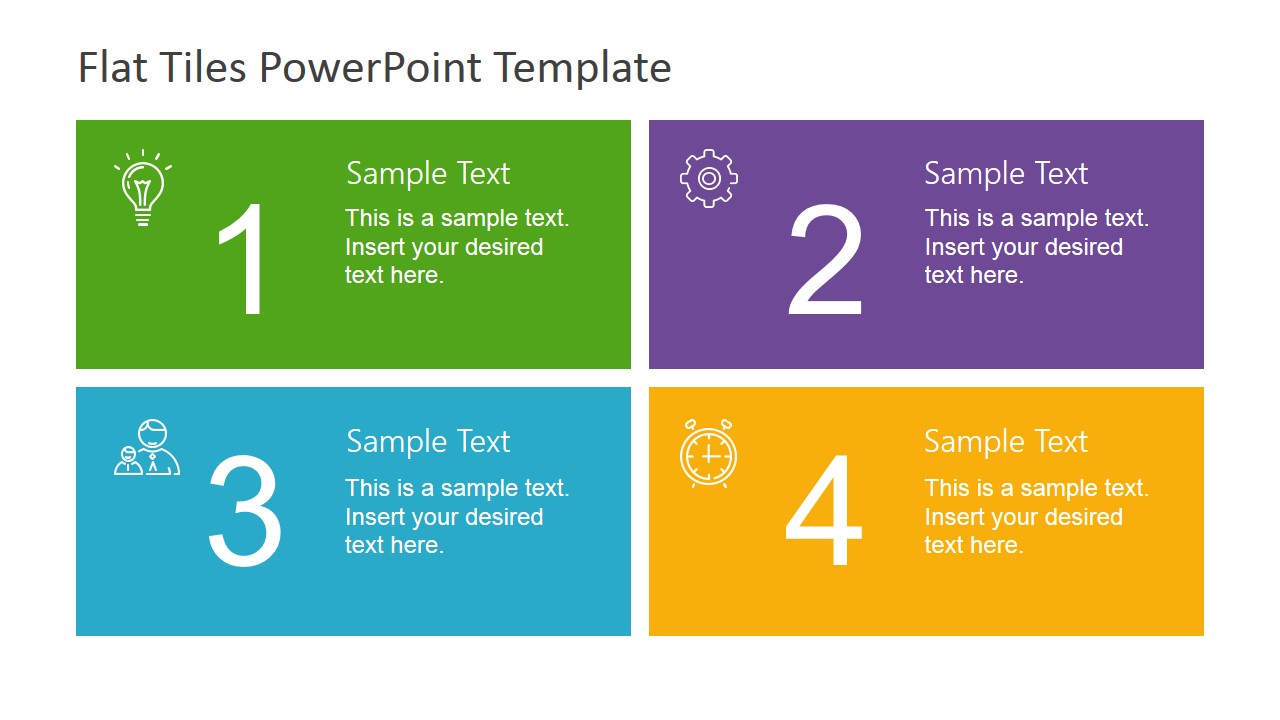
A meticulously designed tiled layout help readability, makes for a crisp presentation and conveys smart thinking being at work, which is an asset for fund raising pitch deck. Most investors would prefer a tiled layout as this saves the need for going through multiple pages, saving previous time.
6- Timeline to highlight milestone: A timeline is a chronological arrangement of events in the order of their occurrence like journey of the startup and a schedule for when to carry out a process or procedure like key milestones of the business plan or how and when the funding will be utilised for expanding the business or rolling out a product.
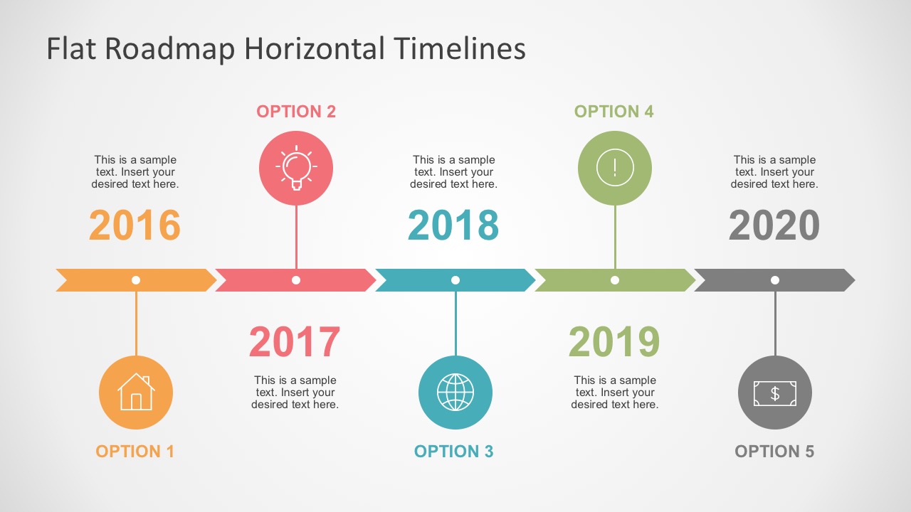
A good looking and an impressive timeline improves communication, effectively highlights complicated content, involves the readers, helps track progress, and highlights critical tasks.
7- Word cloud to display Market Trends: A word cloud is an image composed of words used in a particular text or subject, in which the size of each word indicates its frequency or relative importance. A word cloud is an excellent tool to display market trends, by increasing the font or putting text in large circles, conveying facts or events that has the power to alter the market your startup is operating in. Word cloud demonstrates the significance of displaying keywords.
8- Professional photographs to highlight team: A pitch deck represents your business idea and highlight that your startups are ready for the transformational journey ahead. A vital element of this confidence stems from the people who are working and steering this initiative. The motivation behind the idea, knowledge, experience and specific roles of founders and his team members evokes an instant connection with the investors. They always look for people behind the numbers.

The passion and commitment of the pitch deck story must find a logical place in this section with all key management appearing in a professional attire and oozing out confident, enthusiastic and ready to go attitude. Bringing out heroes who are going to play a crucial role in implementing and moving the startup in a desirable direction or the promised returns.
9- Other information with appealing photos: Words take much longer to create an impression, and images ensure immediate attention of the audience. AlphaValley has a portfolio of elegant and visually appealing images, to make your pitch deck a lively and engaging experience for the investors. The design of stock images establishes the character and personality of your business. Other information and different sections of the presentation in a visually impressive manner increase your credibility.
The use of images makes your story effective in communicating as visuals are more likely to stay in the memory as compared to the content. Images evoke emotional response and are more inclusive in nature as audience could be linguistically diverse. The uniqueness of the visuals and custom images can make your pitch deck stand out and help you meet your own ‘Oracle of Omaha.’
We at AlphaValley helps early, or growth stage startups to raise funds by designing your pitch deck to connect well with your right audience i.e., investors. Our pitch deck design service increases your funding chances multifold by deploying our design experts ‘Investor review framework’ based on the learnings from more than 100 client pitch deck reviews, more than 200 investor screenings and more than US $ 100 Million worth of funds raised successfully. Our pitch deck design helps you raise funds for your startup .
